Spotlight on Colour: Rambunctious Red
Unapologetically intense, red is heavily associated with passion, power, energy, confidence, assertiveness and lust, as well as rage, anger and danger, making it a bold colour choice for interiors. Done well, it can deliver great impact and warm up ultra contemporary interiors, but done badly, it can unsettle and agitate.
The psychological bit
Sitting pretty at the warmer end of the colour spectrum, red is a high visibility colour with a definite call to action. Its boisterousness and demand for attention raises blood pressure, heart rate, respiratory rate, increases libido and enhances metabolism. Therefore this stimulating colour is more suited to certain rooms in your home than others.
Ramp it up or tone it down?
Red in its purest form is bold and demanding and is often given a wide berth when it comes to domestic interiors. However, when diluted with other colours its shades and tones are welcomed with open arms.
The inclusion of blue, purple or orange turns red into maroon, burgundy, crimson or scarlet, making this vibrant colour more palatable and flexible.
How to use red in your home
As this colour is stimulating, motivating, exciting, attention-grabbing and assertive, it’s ideal for your home office and kitchen, ensuring you stay alert and focused on the job at hand. It’s also great when used alongside other primary colours, such as blue and yellow, for playrooms to stimulate play and activity. And of course, red in the bedroom could stimulate energy and passion and elevate your libido. Enough said.
Although red is not generally thought of as a calm colour that you would normally associate with one of the most relaxing rooms in the home, the bathroom is a great place to contain a bold colour of this strength.
Balanced with a white floor and ceiling, contemporary freestanding bath and sink and oversized chandelier, the red walls of this bathroom deliver just the right amount of drama.

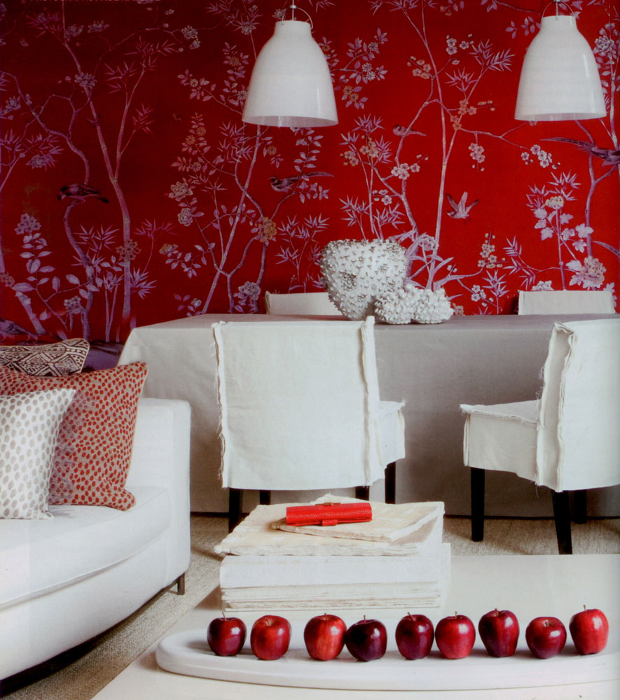
Again, the key to using intense red on a large scale is to team it with plenty of white. This stunning patterned Portobello wallpaper by De Gournay is tempered by white furniture and light fittings, with accessories providing accents in red.
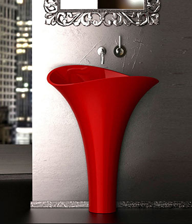
Used sparingly, bright red can inject energy and create a focal point. Set against a backdrop of metallic grey, this freestanding glass basin in red delivers maximum impact to the bathroom design and reminds you to wash your hands before exiting.
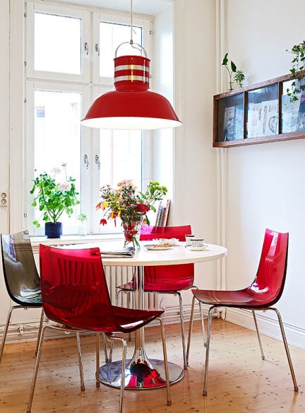
When it’s time to dine, tables can either take centre stage in pillar box red…

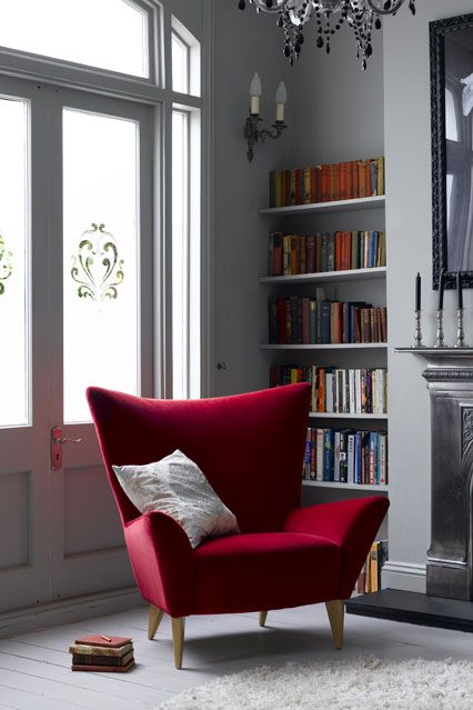
…or play the supporting role to red chairs providing the accent colour in a kitchen-cum-diner.
It’s all about finding the right balance for your interior. So whether it’s pairing red with another strong colour, using it sparingly as an accent colour or as detailing to draw the eye, just have fun with it.

Not ready for red? Then take a look at the other colours featured in our Spotlight on Colour series and find your perfect colour partner. Will it be green, yellow, orange, blue or purple?