Spotlight on colour: Outrageous orange
Heavily associated with sunsets, fruit and autumn, orange is a cheerful, energetic colour that brings warmth and energy to interiors. However, despite its sunny disposition, orange still plays second fiddle to yellow in the popularity stakes. Why? Because it polarises opinion – you either love it or hate it.
Be on trend with a splash of orange
If you’re a fan of the warmer colours of the spectrum, then incorporating orange into your colour scheme could make a welcome change from yellow and ensure you’re bang on trend. The question is, how bright do you go and what other colours work well with orange?
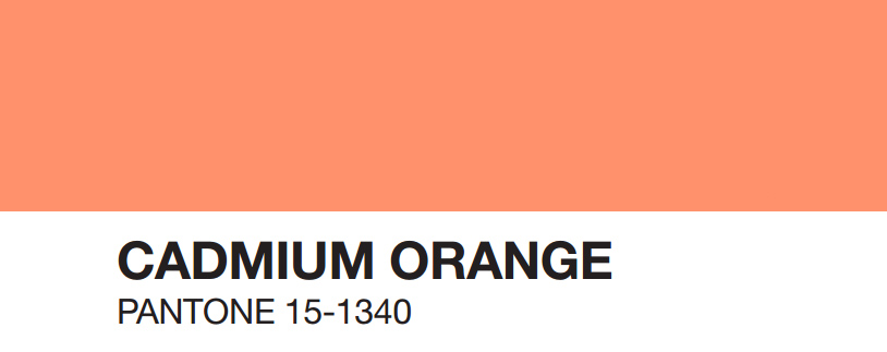
Pantone’s Autumn Colour Trends for 2015 include Cadmium Orange, which plays homage to the 60s and 70s. Described as a ‘warm, welcoming and subtly dramatic orange shade that is striking enough to stand on its own or act as a bold contrast,’ it ‘evokes a sentiment of optimism, fun and fantasy.’
Pantone’s Cadmium Orange works well with Pantone Desert Sage (greenish grey) and Cashmere Rose (soft pink).
The psychological bit
As well as affecting our mood, colour also produces physiological responses. As with other warm tones such as yellow and red, orange can increase the heart rate and blood pressure, as well as produce heavier respiration (source: Design 55). Plus it ‘increases oxygen supply to the brain, produces an energizing effect, and stimulates brain activity’ (source: Science of People).
How to use orange in your home
Orange is associated with power, warmth and high energy and provokes excitement, enthusiasm and happiness. Therefore certain rooms suit this fun and playful hue better than others. Orange is ideal for playrooms and creative spaces such as your home office. Used in moderation it can bring warmth to rooms deemed cold or with a clinical, minimalistic aesthetic and injects heat into living rooms, kitchens and small spaces when used as an accent colour through accessories and furnishings.
Use orange in your workspace to motivate, energise and help your flow of creativity.

styleathome.com
An injection of orange in the playroom will stimulate play and keep the energy levels manageable.

If it makes you happy…go all out and celebrate orange with wall coverings, furniture and accessories. But spare a thought for your poor eyes and give them somewhere to rest with the inclusion of white in your design.

hgtv.com
Or team burnt orange with all shades of blue, including teal, to keep this powerful accent colour in check in your lounge.

etsy
Grey works well with all bright colours and orange is no exception. Warm up a sophisticated grey palette with vibrant orange and stick to key pieces of furniture or accessories if you don’t want to overpower the space.

sarahkaye.com
In the kitchen you can afford to go bold, so take it up a notch with a dedicated wall of orange. Balance your bold choice of colour with a combination of grey, black and white and you can’t go wrong.

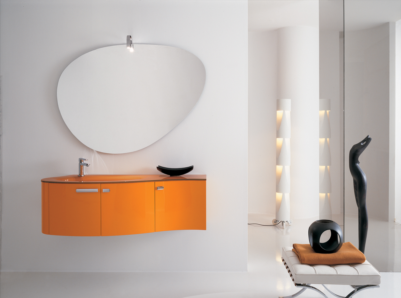
The thought of using orange in the bathroom may send retro shivers down your spine, but when combined with plenty of white, brightly coloured storage can look beautifully contemporary.
Muted orange and fuchsia pink are perfect partners for keeping interiors fun and flirty.

And when it’s time for a gentle wakeup call, a smattering of orange in the bedroom will do the trick.

decorpad.com
See our blog for the latest colour trends and more tips on how to use colour in your home.