Pantone’s Top 10 colours for Autumn 2015
The colour specialists, Pantone, have announced their top 10 colours for Autumn 2015 that will influence fashion, home decor and paint colours. As expected their Colour of the Year for 2015, Marsala, features alongside other earthy neutral tones fit for the season. But it’s not all doom and gloom to match the unsettled weather, these earthy tones are lifted by subtly bold hues in the form of orange, pink, mauve and golden yellow.
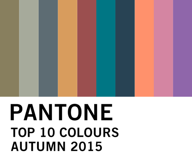
So if you’re looking to spruce up your interiors come autumn, here’s the lowdown on the colours from Pantone’s Color Fashion Report Fall 2015:
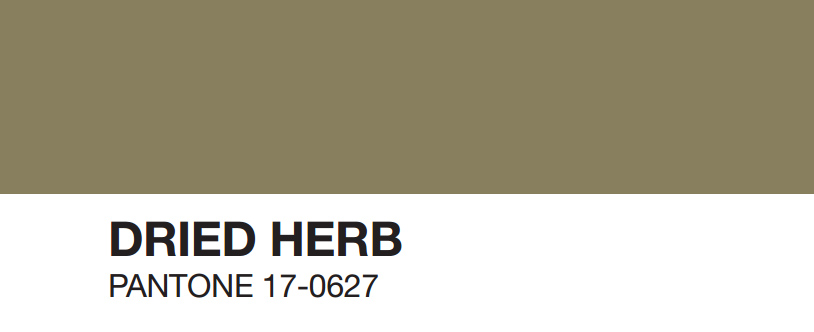
‘An olive green shade once thought of as strictly safari or military, Dried Herb has been elevated into a color we now perceive as sophisticated and chic. Closely related to nature, Dried Herb is an organic shade redolent of nature’s earthy fragrances.’
Works well with Pantone Marsala and Biscay Bay.
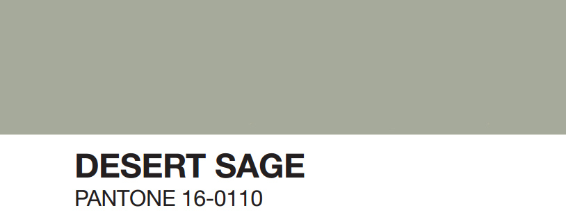
‘A cool and soothing greenish gray. Desert Sage is the ideal neutral. Timeless and unobtrusive yet at the same time stylishly powerful enough to make an impactful statement on its own, Desert Sage speaks to this feeling of naturally inspired colors that remind us of things that are real and not invented.’
Works well Pantone Stormy Weather, Oak Buff, Cadmium Orange and Cashmere Rose.
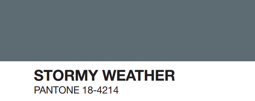
‘Reminiscent of the sky on a gray, over-cast day, Stormy Weather is dependable, cool and above all, constant. Implying quality and luxury, Stormy Weather is a powerful blue gray shade that is strong, protective and enduring.’
Works well with Pantone Desert Sage and Oak Buff.
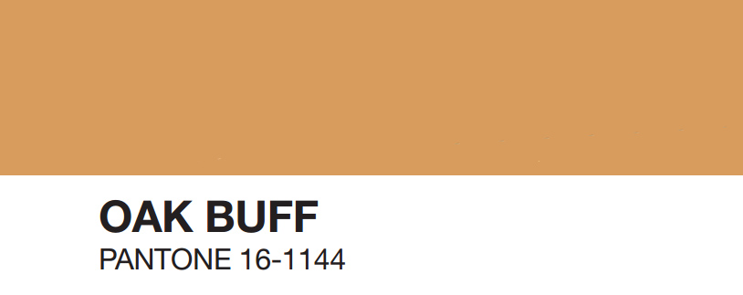
‘Just as the sun comes out after stormy weather to bring us cheer and a glimmer of hope, Oak Buff is a mellow, comforting and warming shade that brings good feelings. Another one of nature’s illustrious shades, the golden yellow Oak Buff acts to nurture and comfort.’
Works well with Pantone Stormy Weather and Desert Sage.
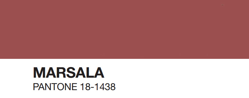
‘Interesting on its own and a wonderful contrast to other hues, Marsala is a winey red-brown that adds finesse and savoir faire. Rich and robust, Marsala incorporates the warmth and richness of a tastefully fulfilling meal, while its grounding red-brown roots point to a sophisticated, natural earthiness.’
Works well with Pantone Dried Herb and Biscay Bay.

‘A lush and elegant teal, Biscay Bay splashes up against more heated tones with its cool touch. Combining the serene qualities of blue with the invigorating aspects of green, the cool and confident Biscay Bay inspires thoughts of soothing tropical waters, taking us to a place that is pleasant and inviting.’
Works well with Pantone Dried Herb and Marsala.
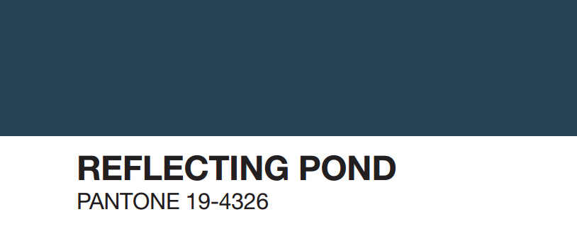
‘Thoughtful, contemplative and composed, Reflecting Pond is a cooling blue with a lot of depth. Conveying a message of credibility, Reflecting Pond is a serious shade that speaks to our need for stability and security.’
Works well with Pantone Amethyst Orchid.
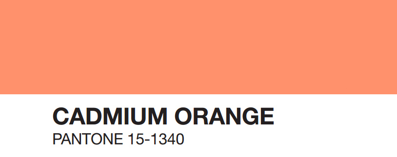
‘A nod to the ‘60s and ‘70s, Cadmium Orange evokes a sentiment of optimism, fun and fantasy. Both playful and sophisticated in its appeal, Cadmium Orange is a warm, welcoming and subtly dramatic orange shade that is striking enough to stand on its own or act as a bold contrast.’
Works well with Pantone Desert Sage and Cashmere Rose.
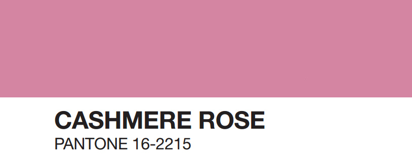
‘A play on the 1960s with a twist of today, Cashmere Rose is a tactile and soft pink hue that renders exactly what it promises. Cultivated in its richness, Cashmere Rose is a gentle and composed pink that is more upscale than downtown.’
Works well with Pantone Desert Sage and Cadmium Orange.
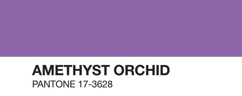
‘Indicative of our affection for color, Amethyst Orchid is the jewel in the crown. Intriguing, vibrant and somewhat sensual, this organic shade is an extraordinary hue that is unique, bold, creative and exciting.’
Works well with Pantone Reflecting Pond.