Relaxing Paint Colours
How do the colours of your bathroom affect how you use it?
Bathrooms are used differently by different families and different family members. If we really are living at a faster pace, then our bathrooms become almost purely functional. We dash in to shower or to use the loo or to clean our teeth. Those among us who wear it, might also use the space to apply our make-up, especially if the lighting is good. And of course the hairy among us to shave!
Dreams of relaxation
Many of us dream of long soaks in the bath tub, especially if we are the proud owners of a contemporary, designer number. Certainly the thought of an hour or so lingering in the warm water doing whatever is necessary which might involve some pampering or just some me-time with a good book surrounded by scented candles, is a dream held by many. Not to mention climbing out into a luxurious, soft towel or robe to continue that sense of indulgence.
I wonder in reality how many of us manage to find time in our busy lives to linger longer in the bath tub as often as we’d like.
Calming colours
How you use your bathroom could also be influenced by colour. You may remember that the predicted colour trend for this year ranged from vibrant, deep colours to pastels.
In general colours can reflect or make the mood. In general reds, oranges and yellows are warm colours whereas greens, blues and purples are cool colours. It’s the cool colours that usually evoke feelings of calmness. This is regardless of trends.
Green known to symbolise health, nature, new beginnings and wealth is said to be one of the ‘easiest on the eye’ colours and great for creating a relaxing space. Blue makes us feel calm – literally seeing this colour can encourage our bodies to produce calming chemicals. Purple is well connected with creativity as well as royalty and wealth but also soothes and calms.
It seems it might be down to just finding the right shade of colour. Here’s some we found earlier.
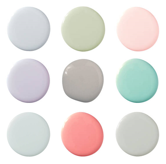
The relaxing colour shades are from a North American paint manufacturer (Benjamin Moore) but you can find similar colours here in the famous brands such as Farrow and Ball, Dulux and the Little Green Paint Company.
Emotive descriptions
Emotive words encourage you when choosing these pale colours. For instance the description of first one is ‘This cloudy shade of blue with gray undertones reminds of the quietness of a rainy day’; a rainy day might surely make you want to take refuge with a pampering session.
More inviting is the mood conjured by the pale green – ‘imagine sitting back in a wicker chair on the veranda, sipping a martini (insert your own favourite tipple) and reading F Scott Fitzgerald.’
While the peachy pink colour suggests the glowing sun of the Caribbean. Irresistible.
I couldn’t do a whole room
Sometimes it’s hard to imagine what feeling the colour will give if the whole room is decorated using one shade. This bathroom uses a similar blue-gray with toning fabric and a ‘splash’ of marble to create the perfect calm space. We reckon it works perfectly.
Leave a Reply