Primary colours: anything but infantile interiors
As children we’re introduced to the primary colours – red, yellow and blue – from a very early age. They feature heavily in the environments we spend time in, the toys we play with, the clothes we wear, the books we read and so on.
As we mature we’re exposed to a much wider range of colours and our allegiance changes, to the point where we fall out of love with them. This is possibly because we perceive them to be childish or our preferences change.
What exactly are primary colours?
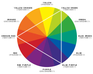
Red, yellow and blue achieve primary status on the colour wheel as they’re the only colours that can’t be made by mixing other colours together. Basically, they’re the top dogs when it comes to colour hierarchy.
nyu.edu
Primary colours form the basis of all other colours. By mixing a combination of two primary colours together you get secondary colours. And by mixing a combination of three primary or secondary colours together, you get tertiary colours and a whole lot more colour to play with.
Creating grown up interiors with primary colours
Primary colours are an obvious choice for playrooms and children’s bedrooms because they’re easily recognisable and familiar. The colours stimulate activity and intellectual development, plus echo colours found in toys etc, so it’s no surprise that they’re used in abundance.
However, these colours are not particularly conducive to other areas of the home that are used for relaxation. In fact, too many primary colours can be an assault on the eye, so it’s imperative to combine them with more neutral tones to balance out the design.
Team with white
When you dilute primary colours with plenty of white, the design takes on a fresh, modern feel. The familiar colours of childhood still hint at playfulness, but the grown up interior says anything but infantile.

Incorporating two primary colours into your predominantly white design, with one taking centre stage and the other providing the accent colour, delivers a bold, yet grown up vibe.
Designs referencing iconic art styles allow you to indulge your love of primary colours without emphasising their childlike connotations.
For instance, kitchen cupboards provide the perfect platform to replicate Piet Mondrian’s abstract style, Neo-Plasticism, which focuses on primary colours encased in a grid of black vertical and horizontal lines on a white background.

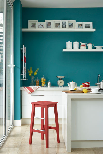
Team with greys
Primary colours are bright and unmistakeable. When used in interiors that favour a more contemporary or industrial feel, they bring an uplifting freshness to grey colour palettes.
By showcasing just one primary colour in your design, you can transform ultra modern interiors into inviting spaces and give your room a bold focal point.
Here floor to ceiling 3D decorative wall panels in red add vibrancy to the room’s safe colour palette of white, black and grey and draw the eye to its most interesting feature.
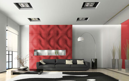
3D Wall Panels
And here, an elegantly shaped contemporary bath in red pops against a dark grey backdrop, leaving you in no doubt about its leading role in both the bathroom and the design.
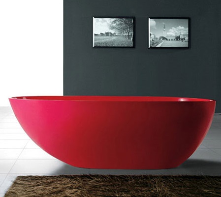
The Red Cleo Bath
Punctuate industrial inspired interiors with furniture and accessories in primary colours to stop the design from feeling cold, oppressive and uninviting.

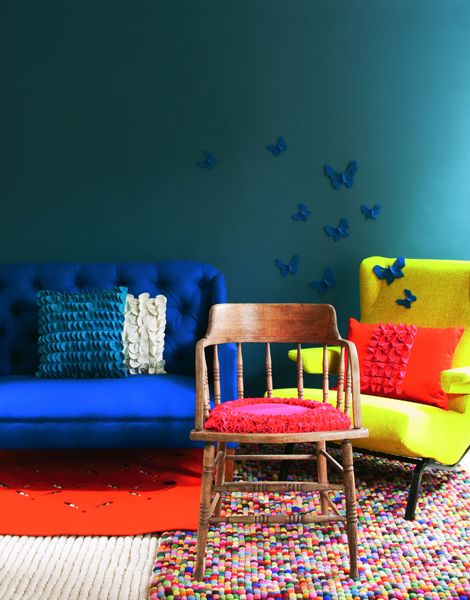
Team with heritage colours
Traditional interiors with period features and historic detailing lend themselves brilliantly to heritage colours, obviously. Their high ceilings and large windows allow them to take on dark, bold colours too.
When combined with furniture and accessories in primary colours, the overall colour palette takes on a rich, jewel-like quality and brings cohesion to the design.


©David Cleveland