Trends for 2014
We are heading to the end of the year, so many designers will have already consulted with trend forecasters to see what’s in store for 2014. For most of us trends are most easily recognisable through fashion – the colours and the fabrics used to create the latest look. But there is much more to trend forecasting than what you see on the catwalk.
Trend forecasters look first at the big picture, i.e. what is going on in the world. They believe this will affect the look and feel of the things we surround ourselves with. While fashion is the easiest access route, trends also filter into many other areas of our lives, including interior design.
One well-known forecaster is Pantone, who every year predict the colours that will be popular for each season.
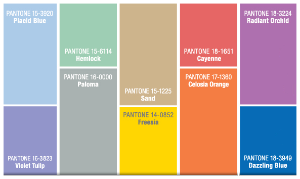
Pantone’s references for spring 2014
Their colour palette for spring ranges from pastels through neutrals to bright colours. Shades of blue and grey seem to be popular next year with accents of bright colours like the spicy red Cayenne, bright yellow Freesia, and the burnt orange of Celosia. There’s also Lilac Tulip and a vibrant mauve/purple called Radiant Orchid – you’ll have noticed the influence of nature.
What does this mean for bathrooms?
The predicted colours might influence the colours in bathrooms. But in terms of bathroom trends, and similarly for kitchens, these rooms aren’t ones we change every year. Most of us would expect our investment in the main features of these rooms to last for years, so trends are more long-term.
One American blogger sees bathroom trends heading for an emphasis on showers, especially those with floor level trays and smooth, seamless lines.
Room decoration
Meanwhile Elle Decoration has translated the catwalk trends for room decoration:
- Graphic black and white as seen in collections by Stella McCartney, Chanel and Proenza Schouler
- Architectural white reflects the more structured designs from Jil Sander, Rag & Bone and Alexander Wang
- Pop of Pink thinks the bright pink colour accents seen on the cat walks will show up in interior design too
- Pastels were the favourite shades of the Spring collections as predicted by Pantone so expect to see mixtures of these delicate colours at home too
- Fringes for texture were spotted in collections by Calvin Klein, Phillip Lim and Proenza Schouler. Use them sparingly and think more of texture than actual fringes
- Gucci, Stella McCartney and Carolina Herrera opted for the monochromatic look and we could see that filter into home décor with rooms decorated in shades of one colour
- Or sheer materials and see-throughs like those used by Valentino, Bottega Veneta and Giambattista Valli will show themselves in the home
Leave a Reply